Rule-inset - CSS Property
Summary of characteristics of the rule-inset property
overlap-join0Discrète: during an animation, the rule-inset property passes from one value to another without transition.Per grammar: serialization in the order of syntax.Syntax diagram of rule-inset.
rule-inset property.The links in the diagram provide more details about the values.
Download the diagram.
In the diagram, the bold terms are the predefined words of CSS, the other terms are described below:
l1,l2,l3etl4: four numeric values followed by one of CSS dimension units.
l1is the value forrow-rule-inset-cap-startandcolumn-rule-inset-cap-start,
l2is the value forrow-rule-inset-cap-endandcolumn-rule-inset-cap-end,
l3is the value forrow-rule-inset-junction-startandcolumn-rule-inset-junction-start,
l4is the value forrow-rule-inset-junction-endandcolumn-rule-inset-junction-end,
All of these values exceptl1are optional.%is a percentage calculated based on the initial spacing of the lines.
Description of the rule-inset property.
 , Chrome
  ,
and a few mobile browsers recognize it.
,
and a few mobile browsers recognize it.
The property rule-inset describes the spaces to leave at the ends of each lines. These spaces come in two types:
- cap when this end is at the end.
- junction when two lines meet.
Each of these types of spaces is then divided into start and end depending on whether the line starts or ends at
that point. These spaces are visible when the property rule-break is set to intersection.
This is shown in the diagram below.
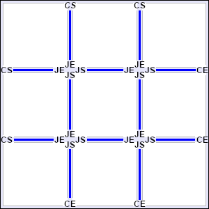
Naming of line ends on a complete grid.
CS: Cap Start - CE: Cap End.JS: Junction Start - JE: Junction End.
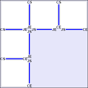
Naming of line ends on an incomplete grid.
CS: Cap Start - CE: Cap End.JS: Junction Start - JE: Junction End.
rule-inset is a shorthand property, well, not exactly, because it applies the same value to spaces on rows as to spaces on columns.
But there are a lot of longhand properties, eight in total, with plenty of shorthand properties across multiple levels.
The first level concerns properties that apply the same value to the start and end ends.
The second level concerns properties that apply the same value to the cap and junction intersections.
Finally, the third-level property applies the values to both rows and columns.
column-rule-inset-cap-startcolumn-rule-inset-capcolumn-rule-insetrule-insetcolumn-rule-inset-cap-endcolumn-rule-inset-junction-startcolumn-rule-inset-junctioncolumn-rule-inset-junction-endrow-rule-inset-cap-startrow-rule-inset-caprow-rule-insetrow-rule-inset-cap-endrow-rule-inset-junction-startrow-rule-inset-junctionrow-rule-inset-junction-end
But there's another way to group these properties, which gives even more summarized properties.
At the first level, the properties apply the same value to the cap and junction intersections.
At the second level, the properties apply to both rows and columns.
column-rule-inset-cap-startcolumn-rule-inset-startrule-inset-startcolumn-rule-inset-junction-startcolumn-rule-inset-cap-endcolumn-rule-inset-endcolumn-rule-inset-junction-endrow-rule-inset-cap-startrow-rule-inset-startrule-inset-endrow-rule-inset-junction-startrow-rule-inset-cap-endrow-rule-inset-endrow-rule-inset-junction-endLanguage support.
All these properties are naturally sensitive to the writing mode of the language, both in direction (ltr or rtl)
and in writing orientation (horizontal or vertical). In the examples below, all the grids had the same value for rule-inset, but
their writing mode is different.
rule-inset:0px/10px 0px;rule-inset:0px/10px 0px;rule-inset:0px/10px 0px;Values for rule-inset.
- rule-inset: 25px 10px / 10px 5px; l1 l2 l3 l4
rule-insetaccepts up to 4 values with the syntax above. These four values can be positive, negative, or zero, but must be followed by one of CSS dimension units. They can also be percentages, calculated based on the initial space between the lines.l1corresponds to the spaces markedCS(Cap Start).l2corresponds to the spaces markedCE(Cap End). By default, they are taken equal to thel1spaces.l3corresponds to the spaces markedJS(Junction Start). By default, they are taken equal to thel1spaces.l4corresponds to the spaces markedJE(Junction End). By default, they are taken equal to thel3spaces if the latter is specified, otherwise they are taken equal tol2.
Reminder: the property
rule-breakmust have received the valueintersection.rule-inset:10px 0px / 0px 0px;rule-inset:0px 10px / 0px 0px;rule-inset:0px 0px / 10px 0px;rule-inset:0px 0px / 0px 10px; - rule-inset: overlap-join;
Any value can be replaced with the keyword
overlap-join. On acap, the value is0. On ajunction, theoverlap-joinvalue makes the nets touch each other.rule-inset:overlap-join 0px / 0px 0px; - rule-inset: initial; (
0) rule-inset: inherit; rule-inset: revert; rule-inset: revert-layer; rule-inset: revert-rule; rule-inset: unset;Common values are presented on these pages:
initial,inherit,revert,revert-layer,revert-rule,unset.
⚠ Of course, our examples only work on compatible browsers (see the table below).
Animation of the rule-inset property.
It is possible to create many effects with rule-inset animation or the corresponding detailed properties. Here's an example.
Simulator.
You can play around with the property values for row-rule-inset and column-rule-inset and see the result on the
grid below.
Browsers compatibility with rule-inset.
For now (2026), only two major browsers support the property rule-inset: Chrome , Edge , and a few mobile browsers.
rule-inset property, which sets the spacing at the ends of row and column separators in a container that displays blocks in rows and columns.row-rule-inset property, which sets the spacing at the ends of the row separators in a container that displays blocks in rows.column-rule-inset property, which sets the spacing at the ends of the column separators in a container that displays blocks in columns.rule-insetproperty
row-rule-insetproperty
column-rule-insetproperty
Browsers on computers :
Mobile browsers :
Outdated or marginal browsers :

Internet Explorer

UC Browser pour Androïd

Opéra Mobile

QQ Browser

Baidu Browser

Safari

Safari sur IOS

Opéra

Samsung Internet
Chrome
Edge

Firefox

Chrome pour Androïd

Androïd Brower

Firefox pour Androïd

KaiOS Browser

Opéra mini
Historic of the rule-inset property.
-
CSS Gap Decorations Module Level 1.
This module covers the rules that define gutters between columns in a multi-column container (grid, flex-box...). It extends these possibilities to gutters between elements arranged in multiple rows, allowing these features to be used on other types of containers. Several properties define how these gutters should be drawn.
Regardingrule-insetDefinition of therule-insetproperty and all other properties related to spacing at the ends of row and/or column separators. April 17, 2025Working Draft.


See also, about space decorations.
The CSS Gap Decorations Module. brings together the properties related to decorative borders, including those that were previously in the
"CSS Multi-Column Module" (like the ones whose names start with column-rule...).
Here are these properties: