Grid - CSS Property
Summary of characteristics of the grid property
nonenoneIntroduction.
Grids are a particularly powerful tool for building complex layouts in CSS. The need for layouts to adapt to increasingly different screen sizes (since mobile phone to the big screen of a TV) is also satisfied by the grids.
To define a grid, use the display property:
display: grid;
This page is a description of the shortcut grid property but also an overview of the operation and possibilities of the grids.
Description of the grid property.
gridis a shorthand property that allows you to set several other properties related to grids:
Example syntaxes for grid.
The grid property aggregates the values of the many individual properties listed above.
Refer to these properties for a more precise description of the syntax.
- grid: 40px 25px / 1fr 2fr 1fr 2fr;
A first example of syntax. Two lines are defined, with a height of 40 pixels for the first and 25 pixels for the second. After the slash (
/) we find the definition of four columns with their respective widths.Note: The relative unit
fr(short for "fraction of") is particularly suitable for sizing columns or rows in a grid. - grid: 'titles titles titles titles' 20px 'middle middle middle right' 40px 'foot1 foot2 foot3 right' 20px / 1fr 1fr 1fr 2fr;
This second example defines four named fields, in addition to three rows and four columns. These areas have been given the names
titles,middle,straightandfoot. The slash always acts as a separator between the definition of rows and columns.See the
grid-template-areasproperty for more detailed explanations of named fields in a grid.
- grid: 30px 50px 20px / auto-flow 25px 40px;
The
auto-flowvalue in the column section (after the slash) indicates a column-by-column padding (i.e. in the vertical direction). The line section (before the slash) specifies three lines, with their height.The fourteen cells of the grid are divided into five columns, since the number of rows is set to three. The width of these columns is alternately 25 pixels and 40 pixels.
1234567891011121314 - grid: auto-flow 20px / 50px 50px 30px;
The
auto-flowvalue this time is in the lines section (before the slash). It indicates a line-by-line padding (i.e. horizontally). Three columns are specified after the slash, with a width of 50 pixels for the first two and 30 pixels for the last.The fourteen cells of the grid are spread over five rows, since the number of columns is set to three. The height of all these lines is 30 pixels.
1234567891011121314
Tutorial: presentation of the grids.
Table des matières.
- Construction of a grid.
- Sizing of the grid rows and columns.
- Count the rows or columns:
auto-fillouauto-fit. - Placement of elements in the grid.
- Alignment of elements in the grid.
- Spacing between lines or columns.
- Definition of ranges in a grid.
- The sub-grid.
- Masonry type grids.
Construction of a grid.
A grid is composed of a container, which receives the display:grid property, and child elements. Most properties are defined
on the container: widths and number of columns, positioning of elements, etc.
Use the buttons to see how little code is required to set up the grid below, both in HTML and CSS.
Sizing grid rows and columns.
Rows and columns in a grid can be created and sized at once with the grid-template-rows and grid-template-columns , applied to the container.
These two properties expect a series of values separated by spaces. Each of the values defines the height of a row or the width of a column. And the number of values defines the number of rows or columns.
Example: here's how to define a grid with 3 rows of 100 pixels in height each. This grid will also have 4 columns each occupying a quarter of the total width of the grid.
	grid template-rows: 100px 100px 100px;
	grid-template-columns: 1ff 1fr 1fr 1fr;
Note: Lines can often be dispensed with. In this case, the height of the lines will be calculated according to their content, and the number of lines will be determined based on the number of items in the grid, given the number of columns.
The example below defines rows of different heights and columns of different widths.
When many rows or columns need to be defined with the same dimension, it is more convenient to use the repeat() function.
The example below defines 20 columns of 30 pixels each:
grid-template-columns: repeat(20,30px);
It is also often convenient to use the fr (fraction) unit, which allows you to distribute the remaining space between columns or rows,
by ensuring that they occupy all the available space, without protruding from the container.
Count the rows or columns: auto-fill or auto-fit.
When the number of columns is not known, it is possible to use auto-fill with repeat(). This value calculates
the number of columns that fit within the width of the grid.
grid-template-columns: repeat(auto-fill, 100px);
auto-fit plays the same role as auto-fill but additionally, the columns or rows that end up empty after
positioning the elements have their width or height reduced to 0.
Refer to the function repeat() for more information on these two values.
Location of elements in the grid.
As soon as the number of columns is defined, the elements are automatically placed in the first available cell according to their order
of appearance in the document.
But it is possible to force their position with the grid-row and grid-column properties.
It is quite possible to mix elements whose position is forced, with elements without position indication. The latter will then occupy the places left free.
Some items can span multiple rows or columns. This is the ace of element number 8, in green on the example. This is defined with the same properties.
Aligning elements in the grid.
A grid container is made up of rows and columns. At each intersection of a row and a column there is a cell, which can contain an element.
Rows and columns can be arranged on the grid in several ways: they can be centered, grouped on one side, or distributed among the available space.
See the justify-content properties for columns and align-content for rows.
By default, the elements contained in the grid fill their entire cell, which eliminates the need to align them, but if not, it is possible to
position the elements in their cells with the justify-items and align-items properties.
These four properties apply to the grid container, and are therefore valid for all elements of the grid.
But it is possible to align the elements individually with the justify-self and align-self properties.
These two properties are the only ones that apply to an element in the grid, not to the container.
justify-content: Defines the positioning in a flex-box or grid along the main axis (most often horizontal).align-content: Manages the arrangement of elements in a flex-box or a grid, following the secondary axis (most often vertical).justify-items: Manages the alignment of items in a grid container along the main axis, which is most often horizontal.align-items: Manages the layout of elements in a grid along the cross axis (most often vertical).justify-self: Sets the alignment of a specific item in a flexbox or grid along the main axis, which is most often horizontal.align-self: Manages the layout of one of the items in a grid along the secondary axis (most often vertical).
The differences between all these properties are not always clear. Here are some principles to help you find your way around:
- Properties whose names begin with
justifyact on the alignment along the line axis (most of the time, for Latin languages, this is the horizontal axis), while properties with names that begin withalignact on alignment along the block axis (the vertical axis for Latin languages). Contentproperties act on the alignment of cells in the grid container, whileitemsproperties act on the elements contained in each of the cells of the grid.
By default, elements fill their entire cell, so the difference betweencontentanditemsis not always visible.- The
selfproperties act on the alignment of only one of the elements of the grid.

Align properties action in a grid
Here is an example. The four columns have been set with a width of 15%, which leaves plenty of room available on the total width of the grid.
We asked with justify-content that these columns group on the left side of the container (start).
By default, items take up all the space in their cell. So we don't see any difference between cells and the elements they contain.
Now here's a variation: the width and alignment of the columns are the same as the previous example, but in addition, we asked with justify-items
that the elements are positioned on the right of their cell (end value).
Finally, in this third example, one of the elements has been aligned in the center of its column. It is clearly visible because its background has been colored blue.
Row and column spacing.
In all the previous examples, the rows and columns touch each other: there is no space in between.
However, you can easily reserve space between rows or columns with the row-gap, column-gap or shortened property gap.
When space is provided between rows or columns, percentage calculations are no longer valid:
They cause the last row or column to overflow outside the container.
To avoid this problem, it is strongly recommended to use the fr unit.
Defining ranges in a grid.
This slightly different technique consists of defining ranges in the grid. Each of the ranges can cover any number of cells,
as long as the shape of the range remains rectangular.
The elements can then be positioned each in one of the grid's ranges.
The main property to know for defining ranges is grid-template-areas .
The sub-grid.
The notion of subgrid concerns, as its name suggests, a grid container included in another grid container.
This notion was introduced in level 2 of the css-grid module.
The example below shows a grid container (in white) consisting of 5 rows and 5 columns. Another grid container (in blue) is inserted into the first grid, and more precisely into a group of six cells, extending from column 2 to column 4, and from line 2 to line 3.

Each of these grids manages the width of its columns and the height of its rows separately.
This will make it difficult to align the columns in the sub-grid with those in the main grid, especially if calculated values are used
(min-content, fit-content, etc.).
In other words, it will be difficult to obtain the provision below.

The css-grid - Level 2 specification provides an easy solution to this problem.
It consists of applying the subgrid value to the grid-template-columns and/or grid-template-rows properties of the sub-grid.
The subgrid value aligns the columns or rows in the sub-grid with those in the main grid.
This feature is starting to be supported at this time. If your browser is compatible, you should see the columns and rows below of the sub-grid align with those of the main grid.
Peculiarities.
Padding and gaps should also be taken into account in the alignment of columns and rows.
In our example, the padding set on the grid cells reduces the size of the cells at the edge of the sub-grid by the same amount.
But not all cells are impacted in the same way: for example, the widths of the cells 2 and 5 of the sub-grid are not modified
by the padding.
For alignment to be possible, the sub-grid must contain as many cells as it occupies in the main grid. In our example, 6 cells. If the sub-grid contains too many cells, the excess cells will not be displayed or will overlap with other cell .
The gaps between the cells of the main grid are inherited by the sub-grid, unless the sub-grid itself has a definition for these spaces.
Row or column names that are set as the main grid are also passed to the sub-grid. But it is possible to define sub-grid-specific names with the syntax below:
	grid-template-columns: subgrid [nom1] [nom2] [nom3]...;
	grid-template-rows: subgrid [nom1] [nom2] [nom3]...;
An example of how to use sub-grids.
It is quite common that one needs to include a grid within another grid. Let's imagine a site that presents products, in this case training courses. For each product, a logo is displayed, a title, a short description, the duration and the price. This information is organized in the form of a grid.
CSS
Level 1
Learn the basics of a currently most common and powerful formatting language.
Now, if you want to display several products on the same page (the catalog), the most practical thing is to insert each one blocks in a grid. We then obtain the result below. The aesthetics are open to criticism because, if the main grid has standardized the height of each of the blocks, the inside of the blocks is not standardized. For example, the horizontal lines are not at the same height, and the same is true for the prices.

Using the notion of a sub-grid, it is easy to insert the blocks into a three-line grid and synchronize the the height of the sub-grid lines on the main grid. The example below is a simulation (image) because some browsers do not yet process sub-grids.

Masonry-type grid.
To create a grid of this type, you need to use display:masonry;. The specification actually suggests using display:grid-lanes;,
but for now, browsers have implemented masonry.
This possibility is provided for in level 3 of the CSS Grid Layout Module specification. It is currently implemented in browsers, but it needs to be enabled:
- Go to the address
about://flagsin a WebKit browser, orabout://configin Firefox. - Search in the search area
masonry. - Set the
CSS.masonry.layoutflag toenabled.
Once you have set the element as a masonry grid, you still need to define the column width or the row height, using the properties
grid-template-columns or grid-template-rows. Do not define both; masonry grid cells have their width or height defined, never
both (otherwise it is a regular grid).
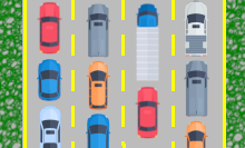
They take the form of row or column construction. They are similar to constructions with bricks of irregular width, hence their name 'masonry'. Another good analogy is cars of different lengths following each other in their lane.


Example of a masonry grid on columns.
Define
grid-template-rows.

Example of a masonry grid on rows.
Define
grid-template-columns.
Most of the properties related to grids also apply to masonry grids. This is the case, for example, with the grid-column and grid-row
properties for positioning an element at a specific spot in the grid, or even for making it span multiple rows or columns.
Grid compatibility with browsers.
Grids are now well supported by all current browsers.
The notion of sub-grids has been added in the "Grid Layout" level 2 specification. A sub-grid is a grid that is itself included in a container of the type grid, and whose columns you want to align or the rows on the parent grid.
Masonry grids are still very little recognized. Firefox  proposes this possibility experimentally with the flag
layout.css.grid-template-masonry-value.enabled that must be set to true (access flags on Firefox).
fr.Notes:
(1) With the browser prefix. Partial support because Internet Explorer follows an old specification.
(2) Disabled on Firefox, can be enabled in setting the flag layout.css.grid-template-masonry-value.enabled to true.
layout
grid
Browsers on computers :
Mobile browsers :
Outdated or marginal browsers :
Internet Explorer
KaiOS Browser
Opéra Mobile
Opéra
Firefox pour Androïd
Samsung Internet
Chrome
Edge
Firefox
Androïd Brower
Chrome pour Androïd
Baidu Browser
QQ Browser
Safari
Safari sur IOS
UC Browser pour Androïd
Opéra mini
Special case of the Internet Explorer browser.
We keep this chapter online, although Internet Explorer is no longer used.
Grid-based layout features are variously supported. The browser that causes the most problems is Internet Explorer. Here are the equivalences between the standard syntaxes and those that will have to be added to obtain a correct rendering with Internet Explorer.
display:grid;display:-ms-grid;You must using
-ms-grid.
grid-template-columns:repeat(4,auto);
-ms-grid-columns:25% 25% 25% 25%;The
repeat() function is not recognized by Internet Explorer: repeat the value as many times as there are columns. On the other hand, the
auto value is not treated in the same way as on the others browsers:
to occupy the full width of the grid, use percentages or the fr unit.
grid-template-rows:repeat(4,25vh);-ms-grid-rows:25vh 25vh 25vh 25vh;Same notes as above: don't use
repeat(), enumerate the values.
grid-row:1;
grid-column:3;
-ms-grid-row:1; -ms-grid-colum:3;Automatic placement is not supported by Internet Explorer: you will need to position all the cells in the grid, whereas it is optional in the standardized version.
grid-row:1/3;
grid-column:2/6;
-ms-grid-row:1; -ms-grid-row-span:2;
-ms-grid-colum:2; -ms-grid-column-span:4;first/last notation is not recognized.
Instead, use the -ms-grid... span to indicate how many rows or columns the cell should span
grid-row-start:1; grid-row-end:3;
grid-column-start:2; grid-column-end:6;
-ms-grid-row:1; -ms-grid-row-span:2;
-ms-grid-colum:2; -ms-grid-column-span:4;Same note as above: use the
-ms-grid properties... span to span to span then cells across multiple rows or columns.
grid-gapgrid-templates-areasgrid-auto-flowGrid property historic.
-
CSS Grid Layout Module Level 1
This specification defines how to create layouts in the form of grids, composed of rows and columns, with a document structure that remains very simple: a container and as many elements as there are cells. Much simpler in any case than tables.
Each of the cells can be aligned horizontally within the width of the columns, or vertically within the height of the rows. They can also be distributed or enlarged to cover all the available space. The content of each of the cells can be aligned horizontally and vertically.
A new unit (fr) is available for sizing columns or rows.RegardinggridFirst definition of all the principles of grid layouts.
Introduction of thegridproperty. April 07, 2011Working Draft.
 September 29, 2016Candidate Recommendation.

-
CSS Grid Layout Module Level 2
This level 2 of the grid specification introduces the concept of a subgrid. It is about grids nested within another, with the preservation of column and/or row alignment.
RegardinggridNo change specifically regarding thegridproperty.February 06, 2018Working Draft.August 18, 2020Candidate Recommendation. -
CSS Grid Layout Module Level 3
Level 3 of the specification introduces a new concept: masonry grids. These are grids in which only the columns or the rows are fixed, with the other dimension able to change depending on the size of the contained elements. This required the addition of several properties.
RegardinggridNo change to thegridproperty itself.
Level 3 mainly introduces “Masonry” type grids (masonry).September 19, 2024Working Draft.
Other properties or functions concerning grids.
The specifications for the grids and associated properties are grouped in the document CSS Grid Layout Module.
Properties: