Border-image-slice - CSS Property
Summary of characteristics of the border-image-slice property
100%Computed value: during an animation, the border-image-slice property gradually changes from one value to another.Per grammar: serialization in the order of syntax.Syntax diagram of border-image-slice.
border-image-slice property.The links in the diagram provide more details about the values.
Download the diagram.
In the diagram, the bold terms are the predefined words of CSS, the other terms are described below:
numberis a numeric value without a unit, positive or zero.%is a percentage calculated either based on the width of the image or on its height.- This syntax can be repeated from one to four times, with separating spaces.
Description of the border-image-slice property.
The border-image-slice property defines how the border image should be sliced. The border is made up of nine image parts: the four corners,
the four edges, and the center. These 9 image parts are taken from a single image defined by border-image-source.

The nine parts of the image aren't necessarily all the same size.
The central part (5) can be used to fill the background of the element. To do this, you need to add the value fill to the
property border-image-slice. And in this case, any background image set by background-image will be hidden.
Relationship between border-image-slice and border-image-width.
The thickness of the border is defined by border-image-width. This property indicates how the elements from border-image-slice
are stretched or compressed. In the examples below, the original image (border-image-source) is as follows, and border-image-slice
is set to 15.

border-image-slice gives patterns bigger than the width of the image border. The pattern is squished.
border-image-slice gives patterns smaller than the image border thickness. The pattern is stretched.
border-image-width has the value auto. The pattern is displayed as is, without any compression or stretching.
Other properties related to border-image.
Values for border-image-slice.
- border-image-slice: 20 15 5 30;
Four positive or zero values, without any unit. They indicate how the image should be divided into nine parts.
The values correspond successively to the distance from the top, right, bottom, and left edges, following the diagram below: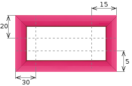
There’s no unit to specify: it’s always pixels if the image is a bitmap, or coordinates if the image is vector-based.
If the values are too large, the central part might be reduced to zero. In that case, the
fillvalue will have no effect (see below). - border-image-slice: 25% 10% 30% 20%; a b c d
The percentages are determined based on the image dimensions: the percentages
banddare relative to the image's width, and the percentagesaandcare relative to its height. - border-image-slice: 20 15 50; a b c
If only three values are specified, the distance from the left edge will be the same as from the right edge.
If only two values are specified, the distance from the left edge will be the same as from the right edge, and the distance from the bottom edge will be the same as from the top edge.
Finally, if only one value is specified, it applies to all sides.
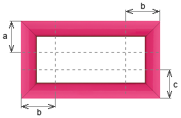 Three values specified.
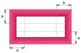 Two values specified.
 - border-image-slice: 20 10 15 15 fill;
The
fillvalue indicates that the central part of the image should be used to fill the element's background. Iffillis not specified, the element's background is transparent, or defined by the other properties related to the element's background. - border-image-slice: initial; (
100%) border-image-slice: inherit; border-image-slice: revert; border-image-slice: revert-layer; border-image-slice: revert-rule; border-image-slice: unset;See the following pages for more details:
initial,inherit,revert,revert-layer,revert-rule,unset.
Animation of the border-image-slice property.
Animating the property border-image-slice is possible, but since its values are strongly tied to the image, the animations might not be very
relevant. Unless you use an image specifically designed for that purpose. It's up to you to let your creativity run wild.
Access the border-image-slice property via a program
With Javascript, change the value of border-image-slice.
In JavaScript, two syntaxes allow you to modify the value of border-image-slice:
- A syntax that uses the style sheet, where the property name is written like in CSS (in
kebab-case). - A second syntax, closer to JavaScript's object notation, in which the property name is written in
camel-case.

	let el = document.getElementById('id');
	el.style['border-image-slice'] = '20';
	// or
	let el = document.getElementById('id');
	el.style.borderImageSlice = '20';
With Javascript, read the value of border-image-slice.
The property must have been applied directly to the element itself via its style attribute, and not through a CSS selector.
Two syntaxes as well.
	let el = document.getElementById('id');
	let value = el.style['border-image-slice'];
	// or
	let el = document.getElementById('id');
	let value = el.style.borderImageSlice;
With Javascript, read the computed value of border-image-slice.
The computed value is the one applied to the element by its style attribute or a CSS selector, or the one that results from the
cascade of inheritances. If none, the computed value will be the property's initial value. In any case, the computed value is defined.
	let el = document.getElementById('id');
	let value = window.getComputedStyle(el).getPropertyValue('border-image-slice');
Write or read the value of border-image-slice with JQuery.
Just like in JavaScript, there are two jQuery syntaxes to write the value.

 // Read the value:
 $('#id').prop('border-image-slice');
 // Write the value:
 $('#id').prop('border-image-slice', '20');
 $('#id').prop('{border-image-slice': '20'});
And to read the calculated value:
let value = $('#id').css('border-image-slice');
Other example.
Find more examples of Javascript and JQuery code on the page Javascript and CSS.
Test it yourself.
The buttons below apply the entered value to the border-image-slice property and then display either the value as it was applied, or the computed
value. The second option lets you see how the value of border-image-slice is stored (serialized). In the case of border-image-slice, these two
values are the same, except when an incorrect value is entered: the applied value is then empty, while the computed value is 100%,
which is the initial value of border-image-slice.
Simulator.
The image used for the border in this example is this one. It measures 45 pixels on each side.
The border-image-width property has been given the value auto.

Browsers compatibility with border-image-slice.
The property border-image-slice as well as other properties related to border images have been properly supported from 2015 to 2017
depending on the browsers.
border-image property.border-image-slice which defines the slicing of an image used for a border in several areas (top left corner, top segment, top right corner, etc.).Notes:
(1) Supports the summary property but not detailed properties.
Doesn't support the space and round values
(2) The small SVG are incorrectly stretched because the percentages for border-image-slice are converted to integers instead of floating-point numbers.
for borders
border-image-sliceproperty
Browsers on computers :
Mobile browsers :
Outdated or marginal browsers :

Internet Explorer

KaiOS Browser

Opéra Mobile

Chrome

Edge

Opéra

Safari

Safari sur IOS

Androïd Brower

Chrome pour Androïd

Firefox pour Androïd

Samsung Internet

Firefox

Baidu Browser

QQ Browser

UC Browser pour Androïd

Opéra mini
Historic of the border-image-slice property.
-
CSS Backgrounds and Borders Module Level 3
Level 3 of the specification also explains how to position the background relative to the background area, and how to crop it.
Regarding borders, the concept of image borders is introduced, as well as the ideas of rounded corners and box shadows.Regardingborder-image-sliceFirst definition of theborder-image-sliceproperty with the introduction of image-borders. August 02, 2002Working Draft.
 December 17, 2009Candidate Recommendation.

See also: other border and background features.
The properties related to borders and border-images are described in the W3C specification called CSS Backgrounds and Borders Module, and here is the list: